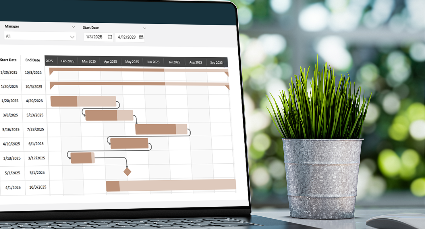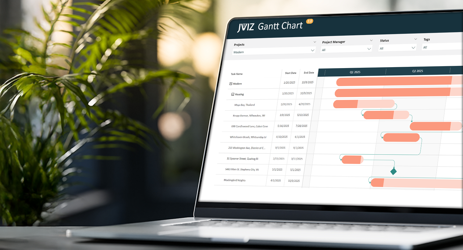
Stay ahead of every deadline and never skip a beat with JVIZ Gantt Chart 2.0. This Power BI certified visual makes it easy to track critical project milestones while maintaining the highest industry standards. Best of all, you can elevate your visual styling in seconds – it is incredibly quick to configure, allowing you to focus on results rather than setup. In this article, we will demonstrate how to set up milestones in your Gantt Chart.
What are Milestones in JVIZ Gantt Chart 2.0
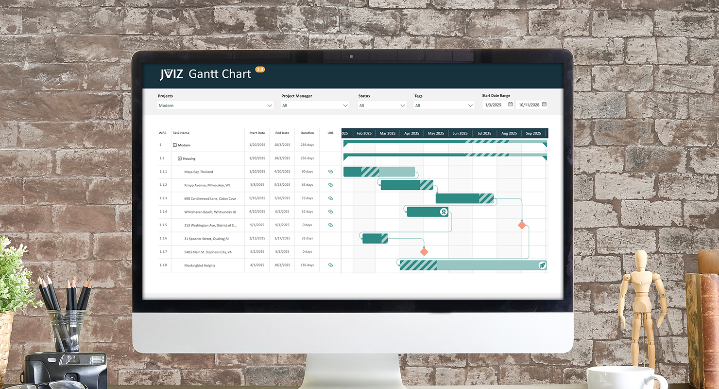
In a Gantt chart, milestones are specific markers that represent significant events, achievements, or checkpoints in a project timeline. Unlike tasks, which represent the work performed over a period of time, milestones typically have zero duration and represent a single point in time. They are commonly depicted as diamond-shaped symbols to distinguish them from horizontal task bars. JVIZ Gantt Chart 2.0 allows users to easily plot milestones lines by just supplying some basic information.
How are Milestones Defined
Before we can display milestones on our Gantt chart, we need to understand how milestones are mapped in JVIZ Gantt Chart 2.0. Milestones require just one field to be supplied in the visual field well – and the value should indicate whether the row is or is not a milestone row:
Milestone Flag: A numerical field that should contain only one of two possible values: 1 or 0.
1 = indicates the row is a milestone.
0 = indicates the row is not a milestone.
Updating your Data Table in Power Query
Let’s begin by creating the values for Milestone Flag in Power Query. To do this, navigate to our data table where we will add one new field. We’ll name our field for this example milestoneFlag. Next, for the new milestoneFlag field, enter the number 1 for any rows that are milestones.
Tip: For milestone rows, it is best practice to have the start date and end date be the same for any milestone rows. This is to ensure expected results. If the start and end dates are not the same for a milestone, then JVIZ Gantt Chart will use the start date as the milestone date.
Before saving your final Power Query changes, make sure the milestoneFlag field is a whole number field.
Creating a Measure in Power BI Designer
From here, you could essentially drag the new milestoneFlag field into the Milestone Flag field well. If you do this, you must set the summarization of the field to either AVG, MIN, MAX, SUM, or COUNT so that it shows the exact value of the milestone flag. If you select COUNT (Distinct) or any other summarization function, you will not get accurate milestone flag mappings.
Note: milestone markers only show when the Gantt chart is expanded to the lowest level in the Task Hierarchy.
Our recommended approach is to create a measure with the logic to map to the selected milestone flag per row.
Fortunately, the DAX code is short and sweet. Let’s create a new measure in Power BI Desktop and paste the code below. Be sure to change the table name and column name to your data table name and column name if you used a different column name than the one used in our example above:
DAX Measure Code:
Milestone Flag = CALCULATE(SELECTEDVALUE(Projects[milestoneFlag]))
Almost done! We are now ready to drag our new measure into the Milestone Flag field well. Make sure to filter your Gantt chart on a set of projects that have milestones.
Hint: If you do not see the milestones appear, ensure you are at the lowest level of the Gantt chart hierarchy.
Milestone Styling
We’re now done with the back-end mapping and can move onto the fun part, styling our milestones. To begin, select the Gantt chart, navigate the visual formatting pane, and expand the Milestones section.
We can choose to have the color of the milestone marker set to the same color as the bars, or we can select a custom color by toggling the Override Bar Color option.
Milestones are markers, and JVIZ Gantt Chart provides several industry recognized symbols to choose for your milestone. Select a symbol from the drop box and watch your chart update. You can also change the size of the milestone, so it fits nicely within your selected visual spacing layout.
Conclusion
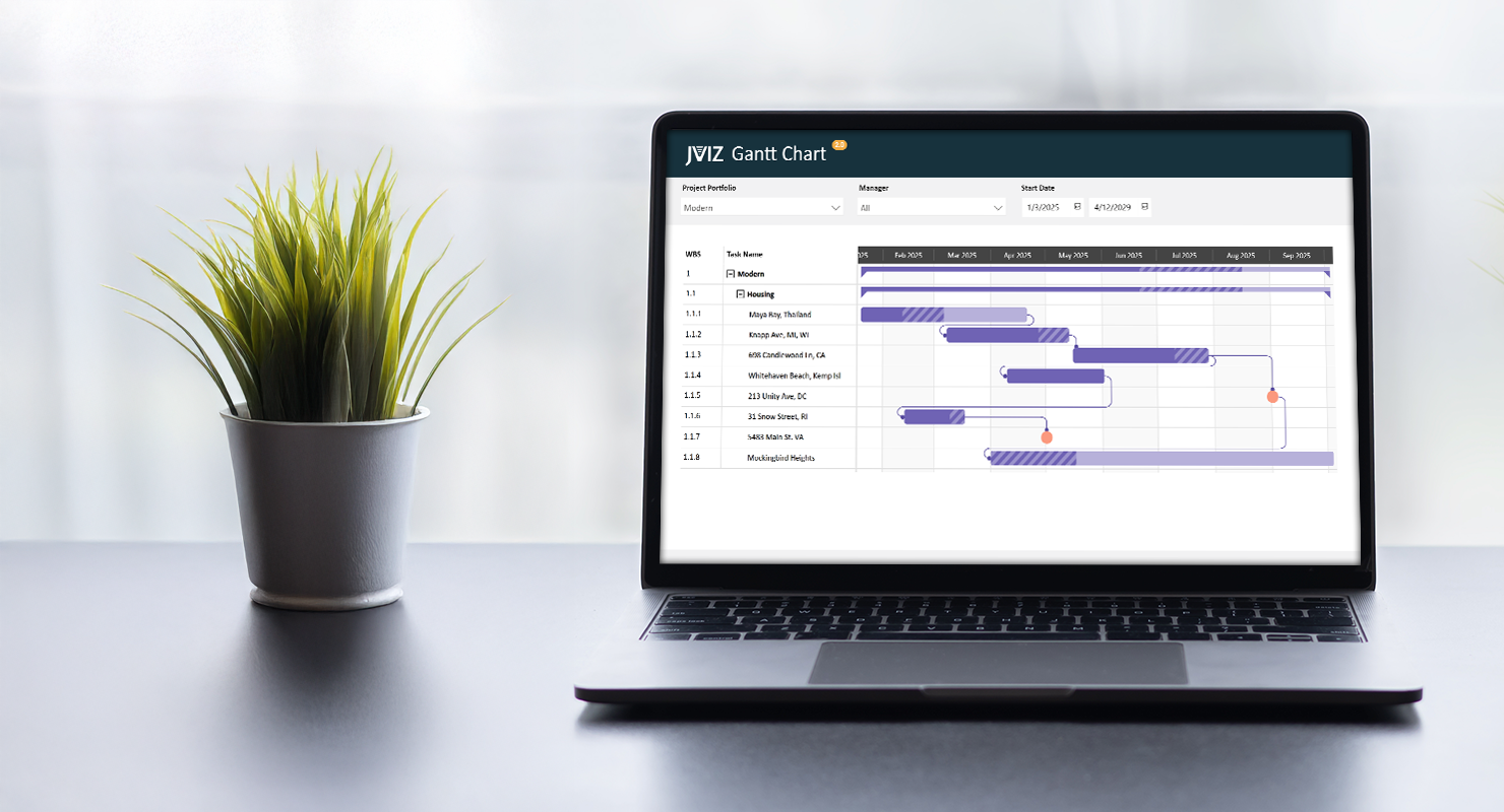
That’s it! Your milestones should now be displayed on your Gantt Chart and as you scroll down and across your timeline, you should see the same milestones you defined in your data table, visualized in the chart.
If you ever need to stop displaying milestones in your Gantt chart, simply remove the Milestone Flag field from the field well. Likewise, you can also update your data table and remove the values from the milestoneFlag column.
Experiment with different milestone markers and colors to refine your visualization. Elevate your reporting from basic to brilliant by adding milestones. It’s the professional edge that transforms your Power BI Gantt chart into a high-impact visual masterpiece.