We have introduced several new innovations in JVIZ Gantt Chart 2.0 that are designed to help your Power BI dashboard captivate your audience. Read on as we dive into one of the spotlight features this week and demonstrate how you can master the Bar Icons.
What are Bar Icons in JVIZ Gantt Chart 2.0
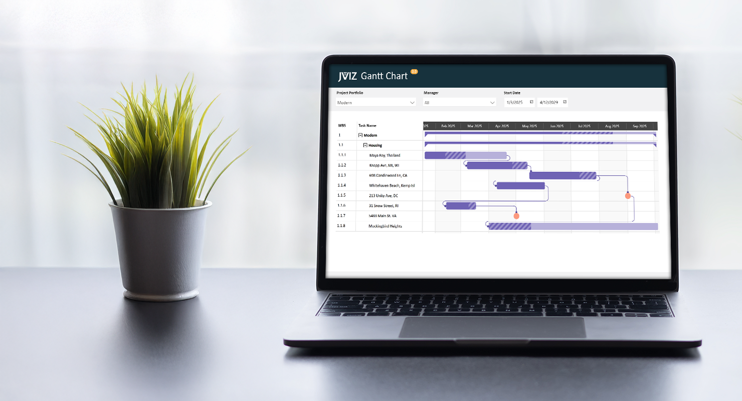
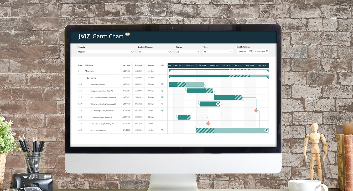
There are times you may want to indicate on a particular task bar that it is a production go-live task by displaying a rocket icon. Or maybe display a test flask icon on a different task bar to indicate the task belongs to the testing phase. Icons are key to helping your audience quickly process what they are looking at without adding extra layers of text to your chart. With JVIZ Gantt Chart 2.0, you can add bar icons based on custom conditions you define in a measure.
Defining Icons by Rank
Before we can display icons to our task bars, we need to understand how bar icons are mapped in JVIZ Gantt Chart 2.0. Icons are mapped to a user supplied number – icon rank identifier (ID) or sequence number. The icon rank ID can range between one (1) and ten (10). This means you can have up to 10 different icon styles displayed across hundreds of task bars based on varying conditions you define in a measure.
For example, let’s define 3 icon rank IDs and their associated icon design that we will eventually place in our data table:
- Icon Rank ID = 1
- Icon Rank ID = 2
- Icon Rank ID = 3
- Icon Rank ID = 4
Updating your Data Table in Power Query
Now that we know icons are mapped to an icon rank ID, we next need to navigate to our data table and add a new field. We’ll name our field for this example BarIconID. This must be a whole number field. In this column, find the specific tasks that should display these three icons. You can tag up to as many tasks as needed, with the same icon ID, there is no limit. For this example, we’re mapping just 3 icon ranks, but you can map up to 10 different icon ranks. When you have finished mapping your tasks to an icon rank, save and load your data changes in Power Query to return to the Gantt chart in Power BI designer.
Creating a Measure in Power BI Designer
From here, you could essentially drag the new BarIconID field into the Bar Icon Rank field well, but you may get unexpected results, as this is acting as an implicit measure, and will automatically SUM, or take the AVG, MIN, MAX, COUNT, etc. of the icon rank ID when rolled up at the parent group level, and that may not be what you’re trying to do.
To produce consistent results, it’s best practice to create a measure and then add your logic there so you can control when to display the icons on the Gantt task bars.
Fortunately, the DAX code is short and sweet. Just create a new measure in Power BI Desktop and paste the code below. Be sure to change the table name and column name to your data table name and column name if you used a different column name than the one used in our example above:
DAX Measure Code:
Bar Icon ID = If(HASONEVALUE(Projects[BarIconID]),SELECTEDVALUE(Projects[BarIconID]),0)
Almost done! We are now ready to drag our new measure into the Bar Icon Rank field well.
Hint: If you do not see the default bar icons appear, ensure you are at the lowest level of the Gantt chart hierarchy.
Bar Icon Styling
We’re now done with the back-end mapping and can move onto the fun part, styling our icons. To begin, select the Gantt chart, navigate to the visual formatting pane, and expand the Bar Icons settings section. Under the Icon card, select which icon rank ID you want to style first. Remember previously, we mapped specific tasks with icon rank IDs 1, 2, 3 and 4. These correspond 1-to-1 with the icon rank numbers that appear in the settings drop-down box. For example, if you tagged several tasks in your data table with the number five (5) – Bar Icon ID 5 – then you will select Icon Rank 5 in the Bar Icon settings to style that icon rank ID. You can map up to 10 different icons in JVIZ Gantt Chart 2.0.
Let’s begin by styling Icon Rank 1. This was tagged to my Task named Santa Monica Beach, CA. By default, each rank displays a blue down arrow icon. Let’s change this default icon design to a Rocket and style it grey using the color settings under the Icon Rank 1 card.
Next, let’s switch over to the task where Icon Rank 2 is referenced. In the Bar Icons settings select Icon Rank 2 in the first card. Notice that this automatically changes the name of the related Icon Rank card below, so you always know which icon rank you are styling. Let’s update this icon design to a Test Flask and update the styling.
Lastly, let’s select the third icon rank from the Bar Icons settings, and set the icon design to the award, and select a green color.
Conclusion
That’s it! The custom icons are now displayed on the Gantt Chart and as you switch to different projects. You should notice only task bars that are mapped to icon ranks in the data table display the icons, whereas all other task bars do not. This is thanks to the logic we applied in our DAX measure.
If you ever need to stop displaying all bar icons on your Gantt chart, simply remove the Bar Icon ID field from the field well, and icons will no longer display in your chart. Likewise, you can also update your data table and remove icon rank IDs from the barIconID column for specific tasks only.
Explore more with different bar icon styles and custom conditional rules to get the look and feel you need for your audience.