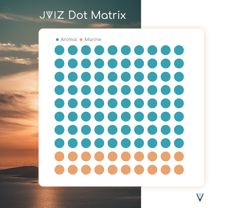
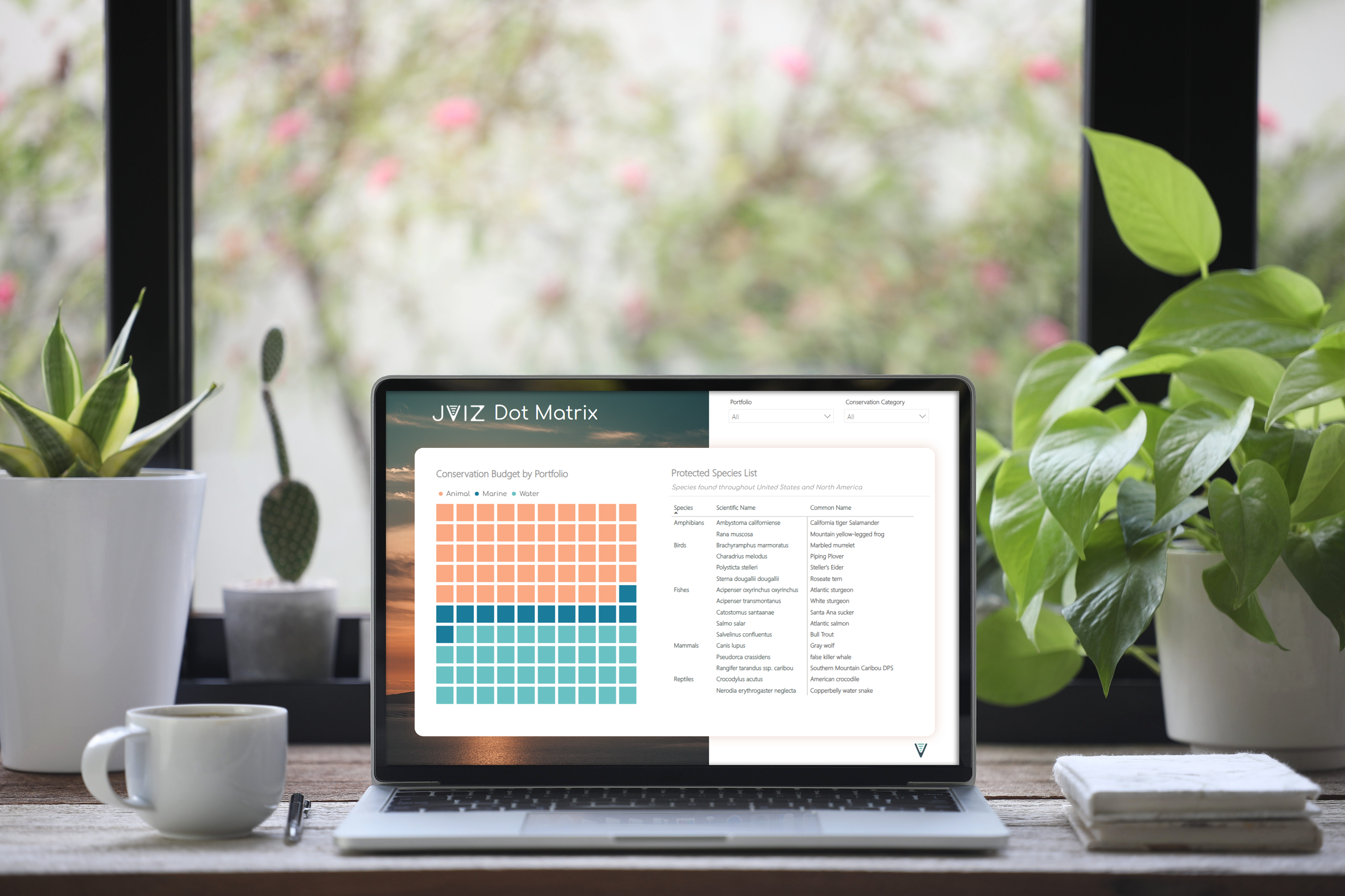
A unique Power BI visual for when you need a quick comparison of discrete data across various categories to see how the parts relate to the whole.
Plot Distribution
Graph proportional or weighted data.
Dot Styling
Adjust size, color, spacing and radius.
Dot Conversion
Visualize large volumes of discrete data.
Custom Legend
Visualize dot color map and weight conversion.
Plot Direction
Swap plot direction and dot column visibility.
Helpful Tips
Toggle the display of warning labels.
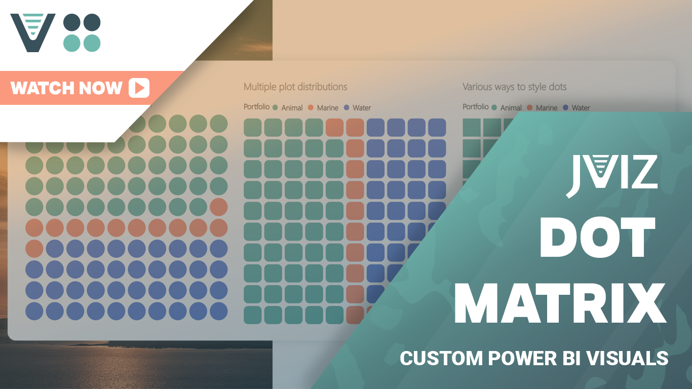
Watch a demo
See JVIZ in action by watching a quick the demo of key features and capabilities. Select plot area distribution, adjust dot colors and sizing of plot area, and see how you can customize the legend and dot conversion labels to represent accurate information.