
JVIZ Gantt Chart Documentation
Visual Layout
JVIZ Gantt Chart 2.0 has three sections: Project Attributes Area, Timeline Area, and Bar Area.
Hover over a hotspot below to view more details.
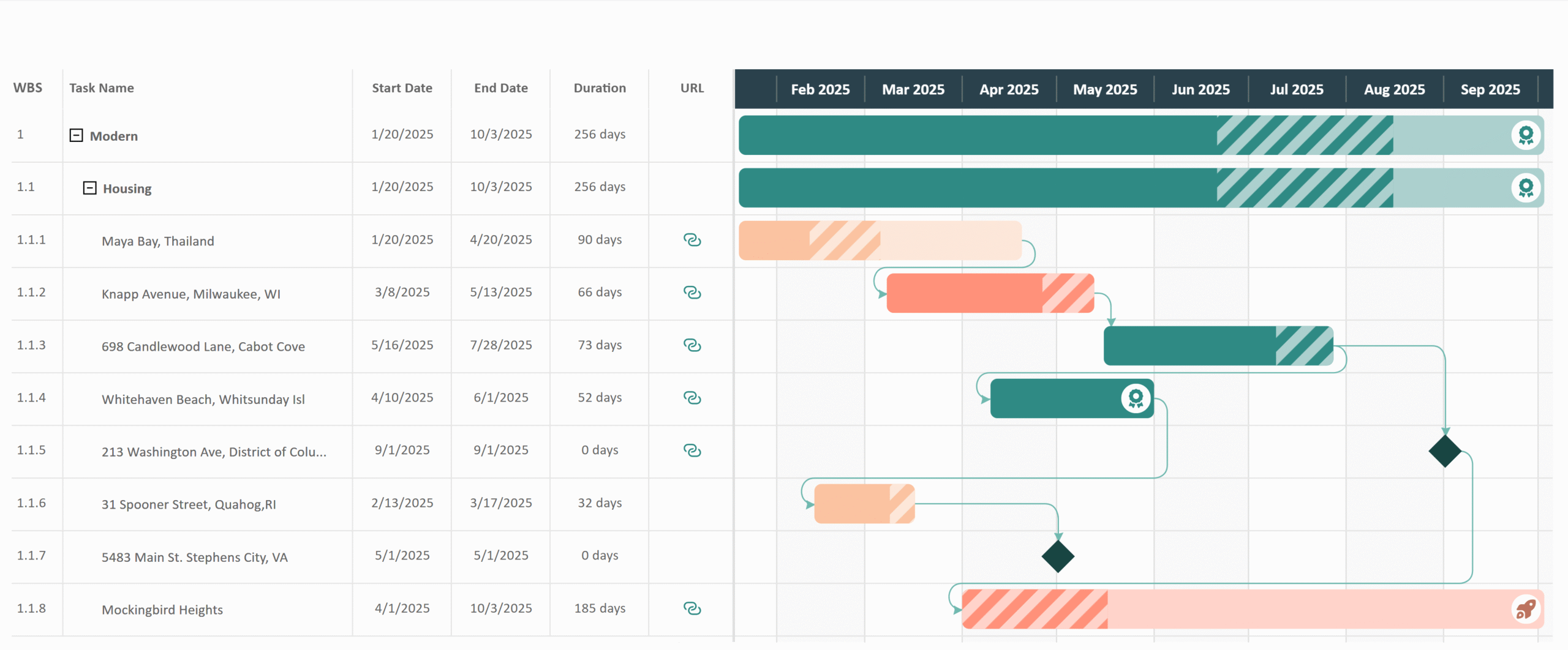
Project Attributes Area
Displays task hierarchy and optional project fields (attributes).
Timeline Area
Scrolling timeline displays year, quarter, month, weeks, and days. Hold-down the [Shift] key and scroll on your mouse wheel to zoom in/out.
Bar Area
Displays task bars, percent complete, dependency lines, milestones, task bar icons, and the today line.
Visual Fields
The visual has 3 required fields (Task Hierarchy, Start Date, and End Date) and 10 optional fields.
Task Hierarchy
Maps to project or task name. Stack values to enable a hierarchy.
Percent Complete
Decimal value that represents percent of work completed.
Start Date
Maps to your project start date.
Percent Range Minimum
Decimal value that represents minimum percent of work completed. Required to display progress range.
End Date
Maps to your project end date. Should be set to the latest end date.
Percent Range Maximum
Decimal value that represents maximum percent of work completed. Required to display progress range.
Task ID
The unique identifier for a task. Required to display dependency lines.
Bar Color
Maps to a hex color field to color individual bars on the roadmap.
Task Status
Maps to the project or task status.
Bar Icon Rank
Numeric value assigned to a task to associate with a specific icon. Required to display bar icons.
Dependency ID
Unique identifier that the task depends on (the predecessor). Required to display dependency lines.
Task Web Link
A hyperlink web URL that can be displayed in the Project Attributes area.
Milestone Flag
Numeric value (1 or 0) that flags if task is a milestone. 1=Yes, 0=No. Required to display milestones.
Layout and Grid
Customizes the basic styling (look and feel) of the Gantt Chart including spacing, hierarchy structure, horizontal and vertical grids.
Visual Spacing: The overall layout style applied to the visual based on content spacing.
- Compact: The spacing between the rows is condensed.
- Normal: (Default) The spacing between the rows is average.
- Spacious: The most spacing between the rows.
This setting determines the hierarchal structure of the chart.
- Toggle On: Displays left Task Hierarchy in a traditional work breakdown structure (WBS) format. Each child row is indented to clearly visualize the parent-child relationship between tasks.
- Toggle Off: Displays left Task Hierarchy in a flat one layer view. Child tasks are not displayed until the user selects the Power BI drill-down buttons to view child tasks.
Indent: Controls how much to indent each level of the matrix hierarchy.
Default is 15px, minimum is 0px, maximum is 25px.
Show Icon: Displays the hierarchy expand/collapse icon buttons.
Icon Color: Sets the fill color of the expand/collapse icon buttons.
Styling for the separator lines between projects (rows) in the project area.
Toggle On/Off: Toggles the display of the horizontal grid lines.
Line Color
Change the color of the horizontal grid line.
Line Style
The line stroke can be set to either: Dashed, Solid, or Dotted.
Line Cap
The ends of the line stroke can be set to either: Butt, Round, or Square. Butt ends the stroke with a sharp 90-degree angle. Round adds a radius to smooth the edge of the stroke. Square is similar to butt, except that it extends the stroke beyond the length of the path.
Styling for the separator lines between timeline intervals (columns) in the project area.
Toggle On/Off: Toggles the display of the vertical grid lines.
Line Color
Change the color of the vertical grid line.
Line Style
The line stroke can be set to either: Dashed, Solid, or Dotted.
Line Cap
The ends of the line stroke can be set to either: Butt, Round, or Square. Butt ends the stroke with a sharp 90-degree angle. Round adds a radius to smooth the edge of the stroke. Square is similar to butt, except that it extends the stroke beyond the length of the path.
Show Banding (Toggle)
Displays or hides the vertical alternate banding color between columns.
Banding Line Color
Change the color of the vertical banding line.
Order
Defines which columns are banded in the timeline. Either even dates or odd dates can be configured with the banding styling.
Timeline
Settings to control the style and function of the timeline.
This setting alters the appearance of the timeline row.
Background Color: The color of the timeline background area.
Grid Color: The color of the tick lines between the date intervals.
Text Formatting
Configures the text color, font family, size, and decoration (bold, italics, underline).
Default text size is 12px, minimum is 8px, maximum is 25px.
This setting configures how the fiscal year is presented in the timeline. Useful for organizations who’s fiscal year does not start on January 1st.
Starting Fiscal Month: The month in which the fiscal year starts.
Default is January. Can be any month of the year.
Starting Fiscal Day: The day in which the fiscal year starts.
Default is 1, minimum is 1, maximum is 31.
Starting Weekday: The week day in which the fiscal year starts.
Default is Monday. Can be any 7 days of the week.
Year Label: Allows the year in the timeline to display a prefix “FY” or “CY” in front of the 4-digit year.
Default is None. Can select “Fiscal” year, for example FY 2026. or “Calendar” year, for example CY 2026.
Project Attributes
Configure styling for the left Project Attributes Area of the Gantt. Control the display of project attributes.
This setting can be toggled on/off. Toggling on adds a vertical divider line visibly separating the Project Attributes Area from the Bar Area.
Color: The color of the vertical divider line.
Width: The width of the vertical divider line.
Default width is 2px, minimum is 1px, maximum is 5px.
Sets the font styling for all text in the Project Attributes Area.
Text Formatting
Configures the text color, font family, size, and decoration (bold, italics, underline).
Default text size is 12px, minimum is 8px, maximum is 25px.
This setting can be toggled on/off. Toggling on adds the row number column to the Project Attributes area.
Background Color: Background color of the row number column.
Width: Width of the row number column.
Default width is 20px, minimum is 1px, maximum is 100px.
This setting can be toggled on/off. Toggling on adds the work breakdown structure (WBS) column to the Project Attributes area.
Background Color: Background color of the WBS column.
Width: Width of the WBS column.
Default width is 40px, minimum is 1px, maximum is 100px.
Start at: Sets the WBS number at a specific starting value other than 1.
Default width is 1, minimum is 1, maximum is 100.
This setting is required as this controls the styling of the task name in the Task Hierarchy.
Background Color: Background color of the task column.
Width: Width of the task column.
Default width is 150px, minimum is 50px, maximum is 500px.
This setting can be toggled on/off. Toggling on adds the start date column to the Project Attributes area.
Background Color: Background color of the start date column.
Width: Width of the start date column.
Default width is 100px, minimum is 50px, maximum is 150px.
This setting can be toggled on/off. Toggling on adds the end date column to the Project Attributes area.
Background Color: Background color of the end date column.
Width: Width of the end date column.
Default width is 100px, minimum is 50px, maximum is 150px.
This setting can be toggled on/off. Toggling on adds the duration column to the Project Attributes area. This is an auto-calculated field based on the difference between start and end date.
Background Color: Background color of the duration column.
Width: Width of the duration column.
Default width is 100px, minimum is 50px, maximum is 150px.
Include End Date: Adds the end date to the duration calculation (adds 1 day to total duration). Can be toggled on/off.
Exclude Weekends: Removes days that fall on a weekend from the duration calculation. Can be toggled on/off.
Weekend Duration (days): The number of days in your weekend. Some countries may have only 1 weekend day, whereas others may have 2 or 3 weekend days.
Default weekend duration is 2 days, minimum is 1 day, maximum is 3 days.
This setting can be toggled on/off. Toggling on adds the task web link (hyperlink URL) column to the Project Attributes area.
Background Color: Background color of the web link column.
Icon Color: Color of the web link icon.
Bar Style
Configure styling for the Bar Area of the Gantt including the display of percent complete.
Controls the styling of the task bar on the Gantt chart.
Color: The default color of the bars. Use the color picker to change the color of the bars.
Note, if you want different colors for different bars, then you must supply a hex color code value in the Bar Color field well (ex. format includes: #000000). The hex color value will override the default color setting. There are several online websites available to help generate hex color codes including W3Schools.
Roundness: Controls the border radius of the bar to make either a square, rounded rectangle, or pill shape.
Default is 0%, minimum is 0%, maximum varies by visual spacing (Compact 50% | Normal 70% | Spacious 100%).
Percent Incomplete Tint: Controls the tint color (lightness) of the incomplete progress area of the bar.
Default is 50%, minimum is 0%, maximum 100%.
Parent Grouping: This setting controls how parent bars appear on the Gantt chart.
- Toggled On: Parent bars have same bar style as child tasks and parent bar icons are visible where applied.
- Toggled Off: Parent bars have a unique thin bar style to indicate the start and end range of child tasks.
Controls the styling of the hatching lines (diagonal bars) that represent a progress complete range. The display of hatching lines requires a Percent Range Minimum and Percent Range Maximum be supplied by the user in the appropriate field wells.
Tip: When supplying the percent ranges in the field wells, recommend to use the average as either an implicit measure or explicit DAX measure to ensure accurate results.
Tint
Controls the lightness of the bar hatching pattern.
Default is 50%, minimum is 0%, maximum is 100%.
Shade
Controls the darkness of the bar hatching pattern.
Default is 0%, minimum is 0%, maximum is 100%.
Transparency
Controls the opacity of the bar hatching pattern.
Default is 100%, minimum is 0%, maximum is 100%.
Tooltip Label
The custom name for the progress range value when users hover over a bar with tooltip enabled.
Default tooltip label is: Percent Range.
Bar Icons
Controls the styling of icons that can be appear on bars. The display of bar icons requires a Bar Icon Rank be supplied by the user in the appropriate field well.
Icons are displayed on task bars based on a user-defined numeric identifier (ID) value between 1-10 called a Rank. It is recommended users use a DAX measure to apply logic that determines which task bars are mapped (ranked) to values 1 thru 10. After your task bar logic is defined, use the Bar Icons settings to style your icon rank levels.
Tip: When supplying the bar icon rank in the field well, recommend to use an explicit DAX measure to ensure accurate results. For example, if a child task’s bar icon has a rank of 5, but the parent must always have a rank of 1, then only through a DAX measure can you control the bar ranking logic rules.
Select Icon by Rank ID: Users must select which icon rank they want to customize. Users can choose up to ten (10) ranks. A rank is a numerical value ranging from 1 to 10.
Design: A list of icons that can be displayed on a task bar based on a selected icon rank.
Icon Color: The color of the icon.
Background Color: The color of the icon’s background area.
Border Color: Color of the circle border surrounding the icon.
Border Width: Width of the circle border surrounding the icon.
Default width is 5px, minimum is 0px, maximum is 5px.
Milestones
Manages the styling of milestone indicators. The display of milestone indicators requires a Milestone Flag be supplied by the user in the appropriate field well.
A Milestone Flag is a numeric value (1 or 0) that flags if task is a milestone. 1=Yes, 0=No.
Override Bar Color: By default (toggled off), the milestone color is the same as the defined bar color. When toggled on, the user can select a different milestone color icon color.
Milestone Symbol: A list of milestone icon symbols to appear on your Gantt chart.
Color: The color of the milestone symbol.
Size: The size of the milestone symbol.
Default size is 80%, minimum is 0%, maximum is 100%.
Dependencies
Styling for the task dependency lines. The display of dependency lines requires both the Task ID and Dependency ID be supplied by the user in the appropriate field well.
To graph dependencies, users must supply a unique Task ID and Dependency ID (predecessor ID for the Task). Each task can have only one Dependency ID.
Interpolation Type: The type of line that connects two dependent tasks. A step interpolation connects two dependencies using 90-degree angles whereas a smooth interpolation connects two dependencies using a curved angle.
Default is Smooth.
Marker: The shape or icon at the end point of the dependency line.
Marker Size: The size of the dependency line marker.
Default size is 5px, minimum is 2px, maximum is 10px
Line Color
The color of the dependency lines.
Line Style
The line stroke can be set to either: Dashed, Solid, or Dotted.
Line Cap
The ends of the line stroke can be set to either: Butt, Round, or Square. Butt ends the stroke with a sharp 90-degree angle. Round adds a radius to smooth the edge of the stroke. Square is similar to butt, except that it extends the stroke beyond the length of the path.
Line Width: The width of the dependency line.
Default width is 1px, minimum is 1px, maximum is 10px.
Today Line
Styling for the vertical Today Line that indicates the current date on the Gantt chart.
Settings for the today line vertical bar. Can be toggled on or off.
Line Color
Change the color of the Today Line.
Line Style
The line stroke can be set to either: Dashed, Solid, or Dotted.
Line Cap
The ends of the line stroke can be set to either: Butt, Round, or Square. Butt ends the stroke with a sharp 90-degree angle. Round adds a radius to smooth the edge of the stroke. Square is similar to butt, except that it extends the stroke beyond the length of the path.
Line Width
Adjust the thickness of the Today Line.
Default is 3px, minimum is 1px, maximum is 5px.
Sorting
Controls the sorting of the bars in the Bar Area.
Changes the sort order for the bars within the graphed bar area. Can be toggled on/off. Default sorting is by start date.
Sort bars by
Start Date: Sort tasks in the bar area by the start date.
End Date: Sort tasks in the bar area by the end date.
Task Name: Sort tasks in the bar area by the task name.
Dependency: Sort tasks in the bar area by dependencies.