
JVIZ Strategic Roadmap Documentation
Visual Layout
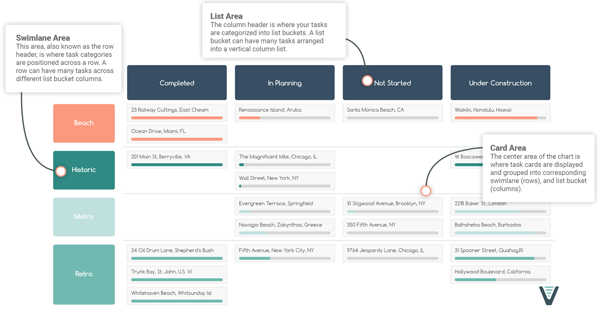
JVIZ Strategic Roadmap has three sections: List Area, Card Area, and Swimlane Area.
Visual Fields
The visual has three required fields (Card, Swimlane, List) and three optional fields (Percent Complete).
Card
Maps to your project or task name.
Percent Complete
A decimal value that represents percent of work completed.
Swimlane
The row header area that maps to a project or category name.
List
Maps to your project or task bucket lists.
Visual Formatting
Customize the card area styling.
Card Height
Adjust the height of the card.
Default is 30px, minimum is 20px, maximum is 50px.
Background Color
Select a background color for the card.
Text Formatting
Configure the text color, font family, size, and decoration (bold, italics, underline).
Default text size is 11px, minimum is 8px, maximum is 25px.
Card Sort
Choose how to sort the cards within a list bucket group.
Default is Ascending.
Show Progress Bar
Toggle on to show the percentage bar on the card. Toggle off to hide the percentage bar on the card.
Progress Bar Height
Set the height of the percentage bar on the card.
Default text size is 7px, minimum is 5px, maximum is 20px.
Progress Bar Padding
Adjust the padding space around the percentage bar.
Default text size is 5px, minimum is 5px, maximum is 10px.
Format the swimlane row header style.
Make Sticky
Can be toggled on or off. Makes the swimlane row header area stick to the left of the visual when scrolling left to right.
Text Formatting
Configure the text color, font family, size, and decoration (bold, italics, underline).
Default text size is 16px, minimum is 8px, maximum is 25px.
Swimlane Width
Adjust the swimlane area width.
Default is 150px, minimum is 50px, maximum is 300px.
Border Radius
Adjust swimlane border radius.
Default is 150px, minimum is 0px, maximum is 50px.
Swimlane Sort
Choose how to sort the swimlane categories.
Default is Ascending.
Background Color
Use the color picker to set the background color of the swimlanes. If Show All Colors is toggled on, then the individual colors selected for each swimlane will take precedence over this background color selection.
Show All Colors
Can be toggled on or off. When toggled off, all swimlanes are the same color as the Background Color property. When toggled on, users can select an individual color for each swimlane using the color picker.
Controls the styling of the list columns.
Make Sticky
Can be toggled on or off. Makes the list column header row stick to the top of the visual when scrolling top to bottom.
Background Color
Select a background color for the list bucket.
Text Formatting
Configure the text color, font family, size, and decoration (bold, italics, underline).
Default text size is 14px, minimum is 8px, maximum is 25px.
List Height
Adjust the height of the list bucket categories.
Default is 70px, minimum is 50px, maximum is 100px.
Minimum Width
Set a minimum width for the list bucket category. When you collapse (shrink) the visual horizontally, the minimum width will determine the width of the list bucket columns and if there is overflow, the horizontal scroll bar will become activated.
Default is 150px, minimum is 100px, maximum is 300px.
Border Radius
Adjust list column border radius.
Default is 5px, minimum is 0px, maximum is 50px.
List Padding
Change the padding in-between the list bucket columns.
Default is 20px, minimum is 5px, maximum is 50px.
List Sort
Choose how to sort the list bucket categories.
Default is Ascending.