JVIZ Talking Points Documentation
Visual Layout
JVIZ Talking Points has two main sections: General Settings and Talking Point settings.

Visual Fields
JVIZ Talking Points has one required field: Talking Points
Talking Points
Maps to a text, number or date field that should appear in the text layout based on the order stacked in the field well. Duplicate values in top-level parent fields are permitted. JVIZ Talking Points will group child talking points under parent talking points.
Visual Formatting
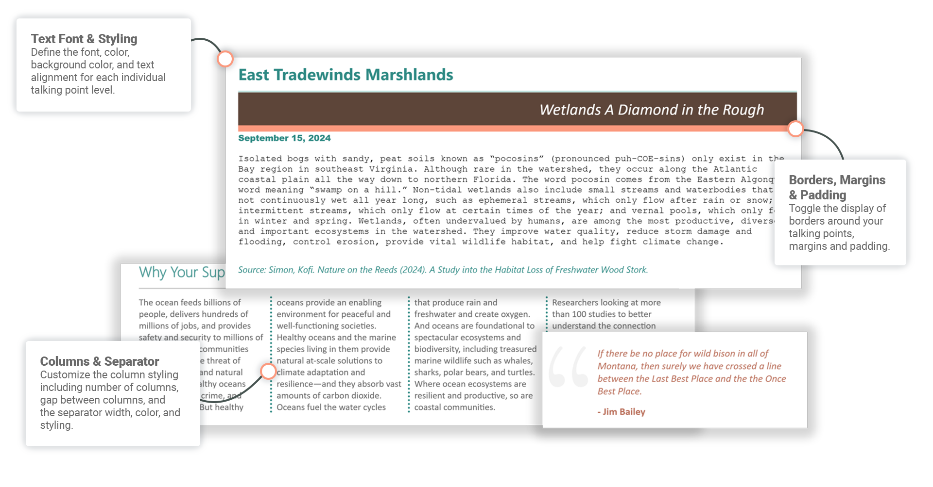
Customize the design of the column layout.
Columns
Columns
Sets the number of columns shown in the text area.
Default is 1, minimum is 1, maximum is 5.
Gap Between Columns
Adjusts the amount of space between columns.
Default is 0, minimum is 0, maximum is 200.
Separator
Column Separator Toggle On/Off
Can turn on/off the visibility of a column separator.
Column Separator Width
Adjusts the width of the column separator bar.
Default is 1, minimum is 1, maximum is 100.
Separator Column Separator Style
Applies a separator style to the column bar. Options are listed below. For examples of border styles visit W3Schools:
Dashed – Defines a dashed border.
Dotted – Defines a dotted border.
- Solid – Defines a solid border.
Column Separator Color
Changes the line color of the column separator.
Controls the text formatting of the talking points. Settings are the same for all talking point levels 1 thru 5.
Format
Font
Configure the text color, font family, size, and decoration (bold, italics, underline).
Default text size is 16px, minimum is 8px, maximum is 60px.
Format Background Color
Configure the background color for the area surrounding the talking point.
Layout
Margin
Configure margins around the text area.
Default margin is 0px, minimum is 0px, maximum is 100px.
Padding
Configure the padding around the text.
Default padding is 0px, minimum is 0px, maximum is 100px.
Text Alignment
Configure the alignment of the text in the area.
Border
Styling
Applies a border outline style around the text area. Options are listed below. For examples of border styles visit W3Schools:
Dashed – Defines a dashed border.
Dotted – Defines a dotted border.
Double – Defines a double border.
Groove – Defines a 3D grooved border. The effect depends on the border-color value.
Inset – Defines a 3D inset border. The effect depends on the border-color value.
Outset – Defines a 3D outset border. The effect depends on the border-color value.
Ridge – Defines a 3D ridged border. The effect depends on the border-color value.
Solid– Defines a solid border.
Default border style is Solid.
Top/Bottom/Left/Right
Toggle on or off to display the border at the selected position.
Color
Changes the color of the border.
Width
Controls the thickness of the border.
Default width is 1px, minimum is 1px, maximum is 100px.
Hyperlink
Toggle on to activate the hyperlink and make clickable. Toggle off to deactivate the hyperlink so it is not clickable.
Style
Select to display the hyperlink text (inline) or to display a hyperlink icon (icon).
Default style is inline.
Icon Size
Applies only if Hyperlink Style is set to Icon. Adjust the size of the icon image: small, medium or large.
Default icon size is medium.
Icon Color
Applies only if the Hyperlink Style is set to Icon. Sets the icon color from a list of predefined colors.
Default icon color is black.